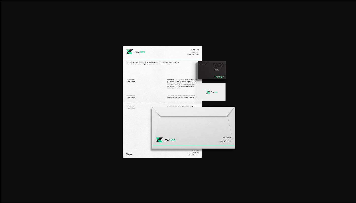
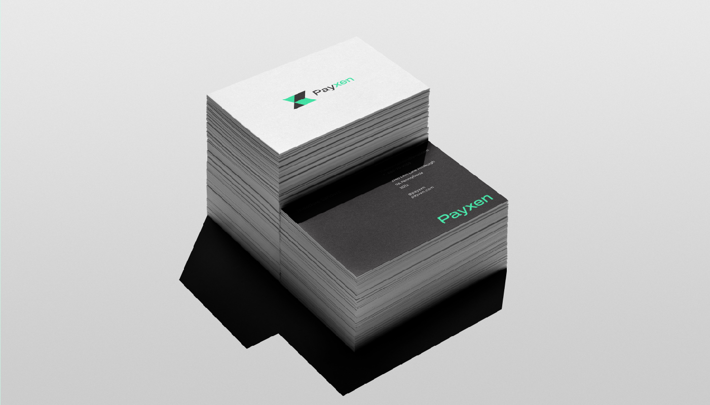
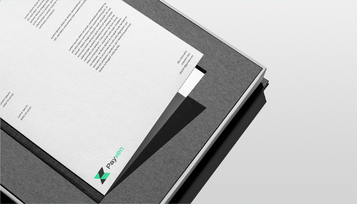
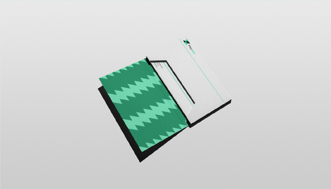
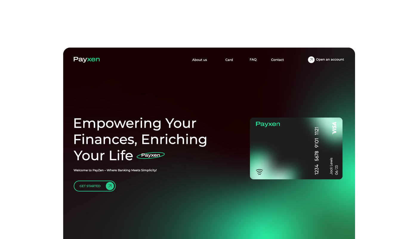
Payxen Logo Design
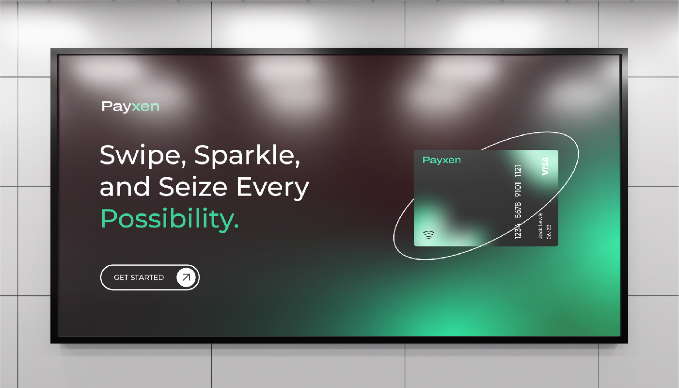
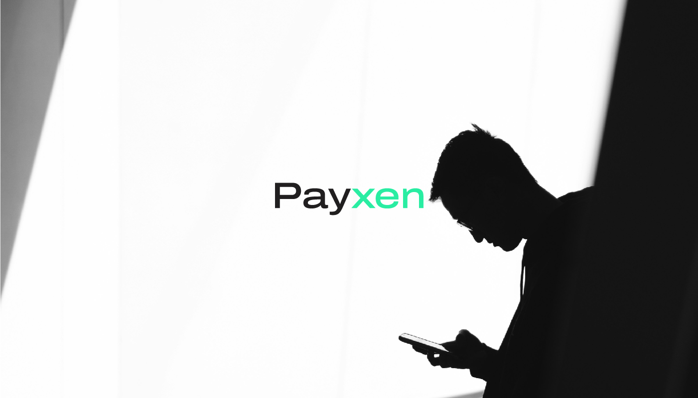
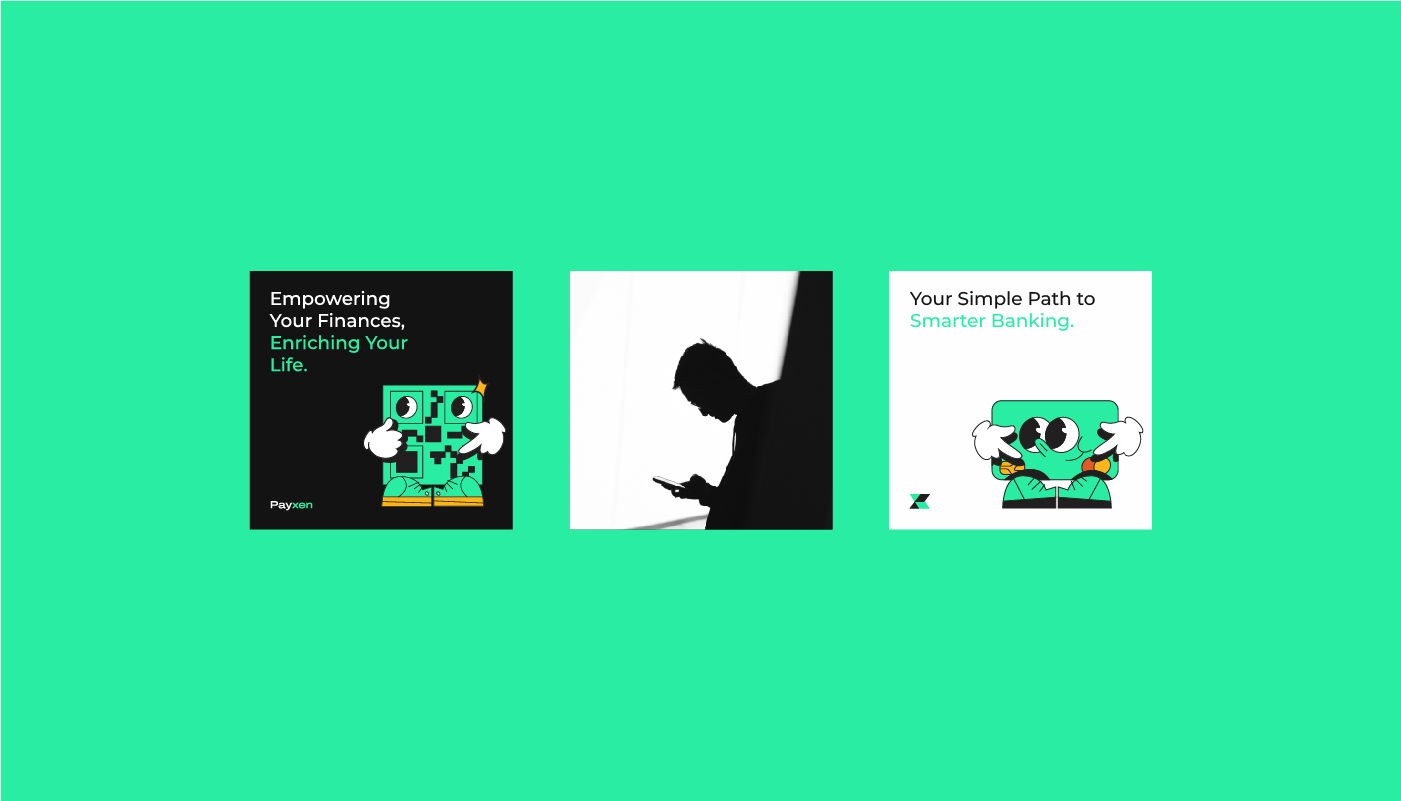
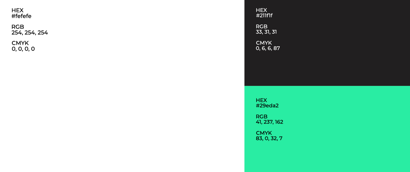
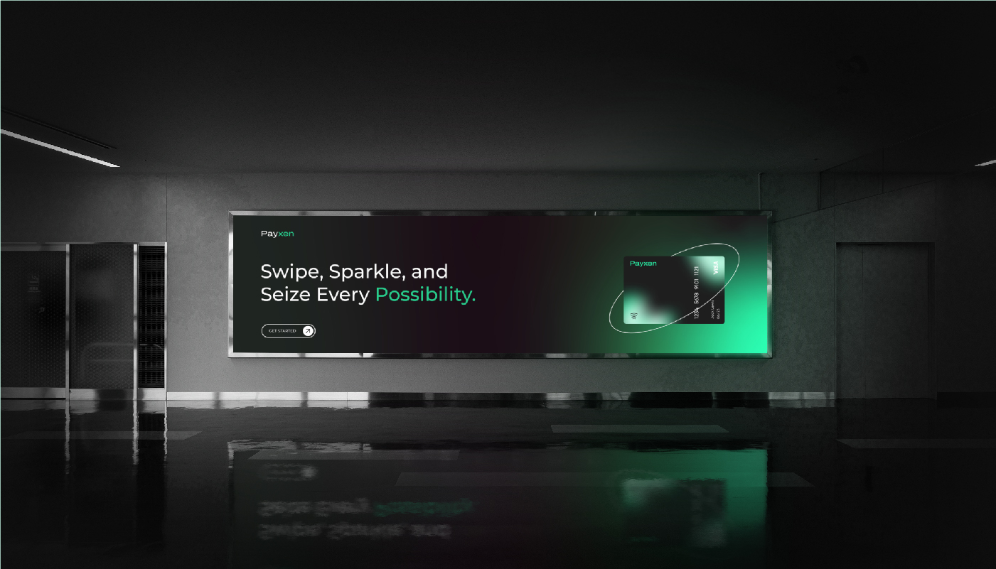
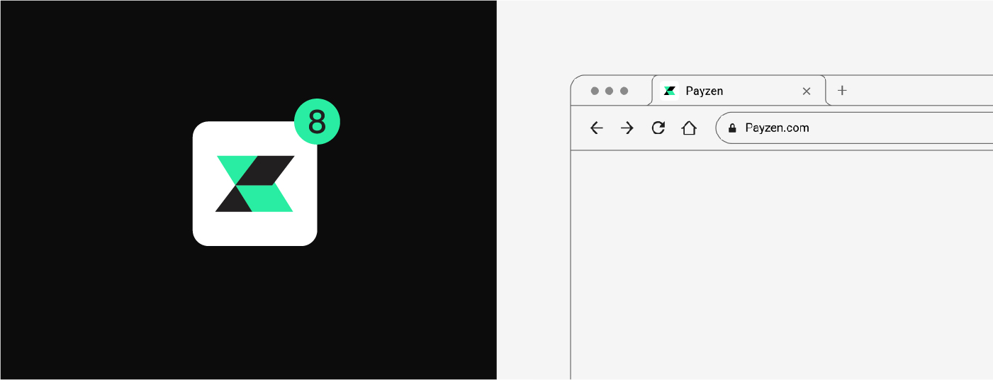
For the Payxen Logo Design, the goal was to create a sleek and professional look that embodies trust, reliability, and innovation in the financial sector. The logo uses clean, modern typography to reflect the cutting-edge nature of Payxen’s services, while also ensuring that the design feels approachable and easy to recognize. The choice of colors is thoughtful—typically using blues, greens, or metallic accents—symbolizing security, growth, and professionalism. If there's an icon or visual element, it’s likely a simple, geometric shape or abstract symbol that conveys connection, movement, or stability. This logo is designed to be memorable, versatile, and reflective of the forward-thinking approach Payxen brings to the financial industry.