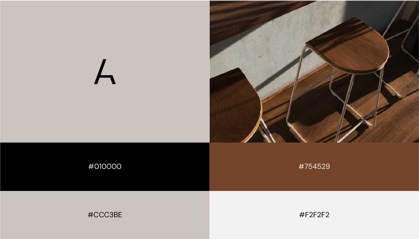
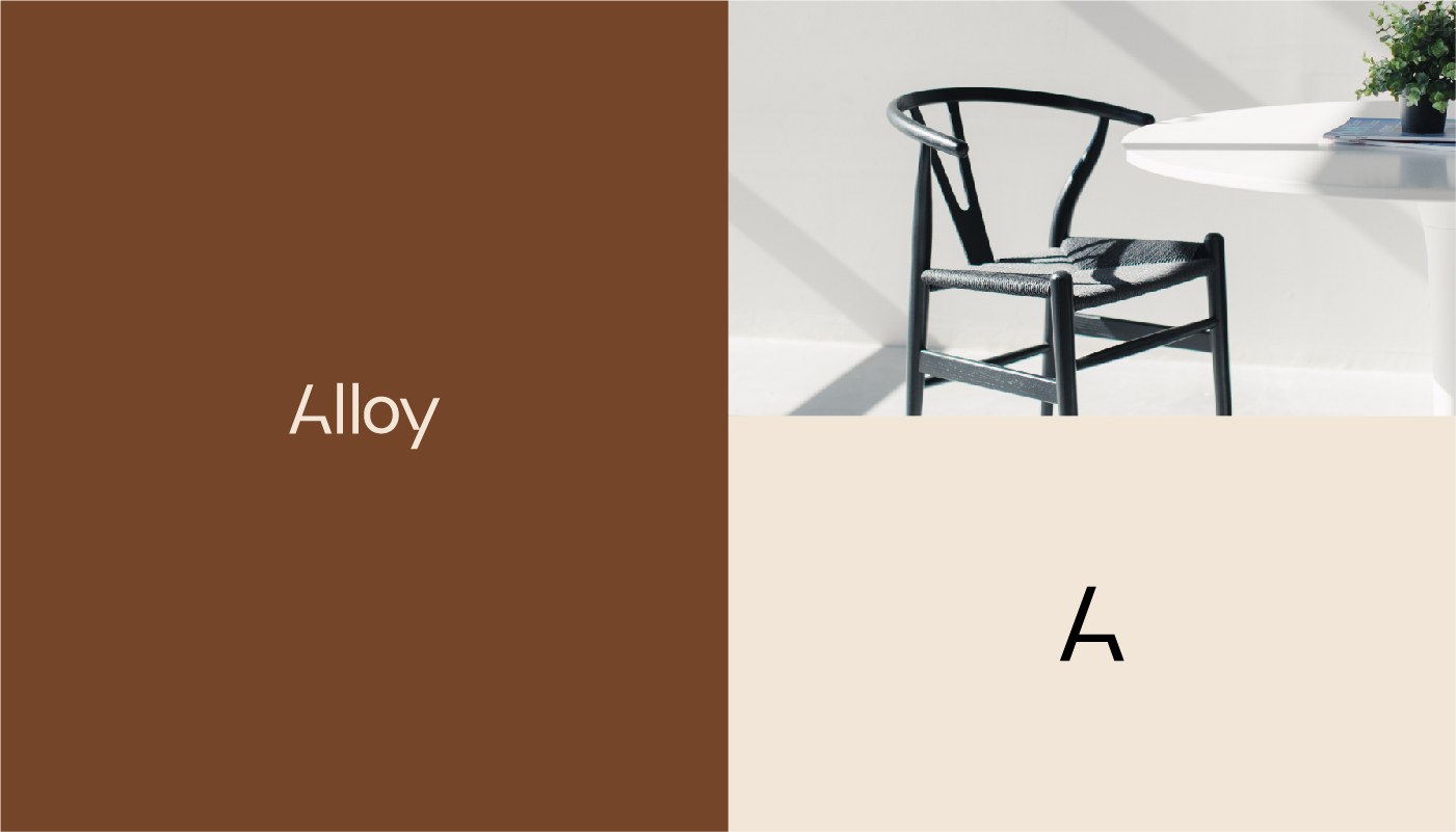
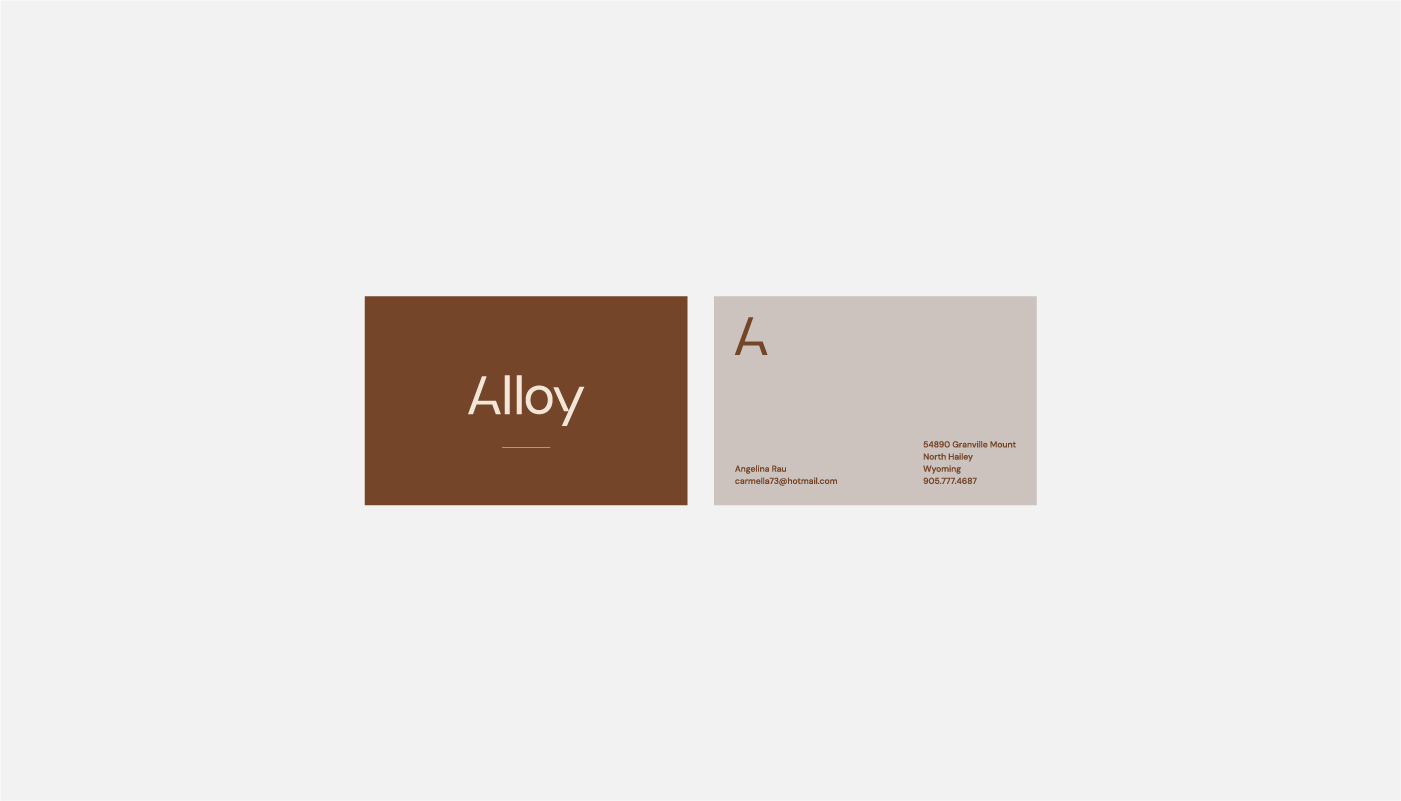
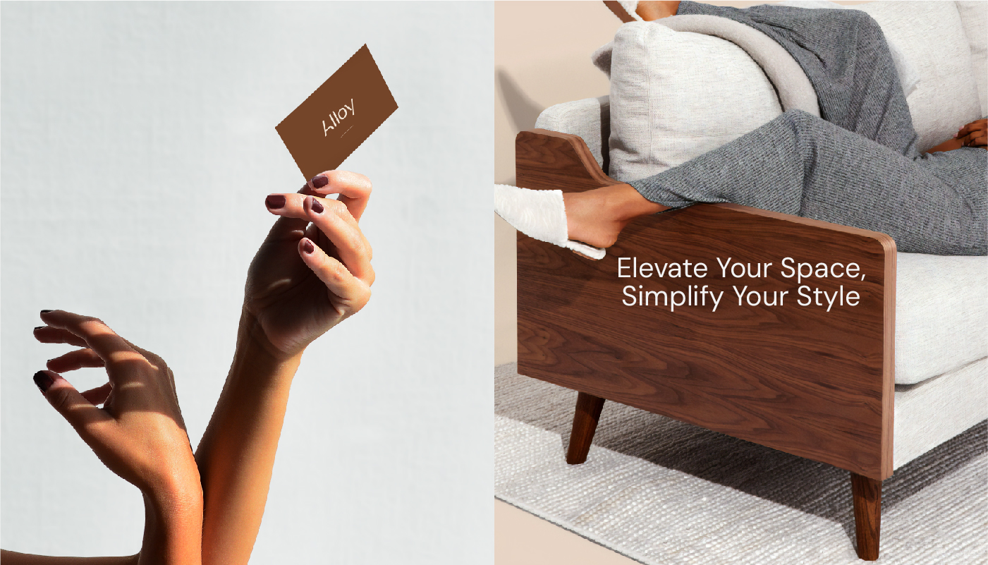
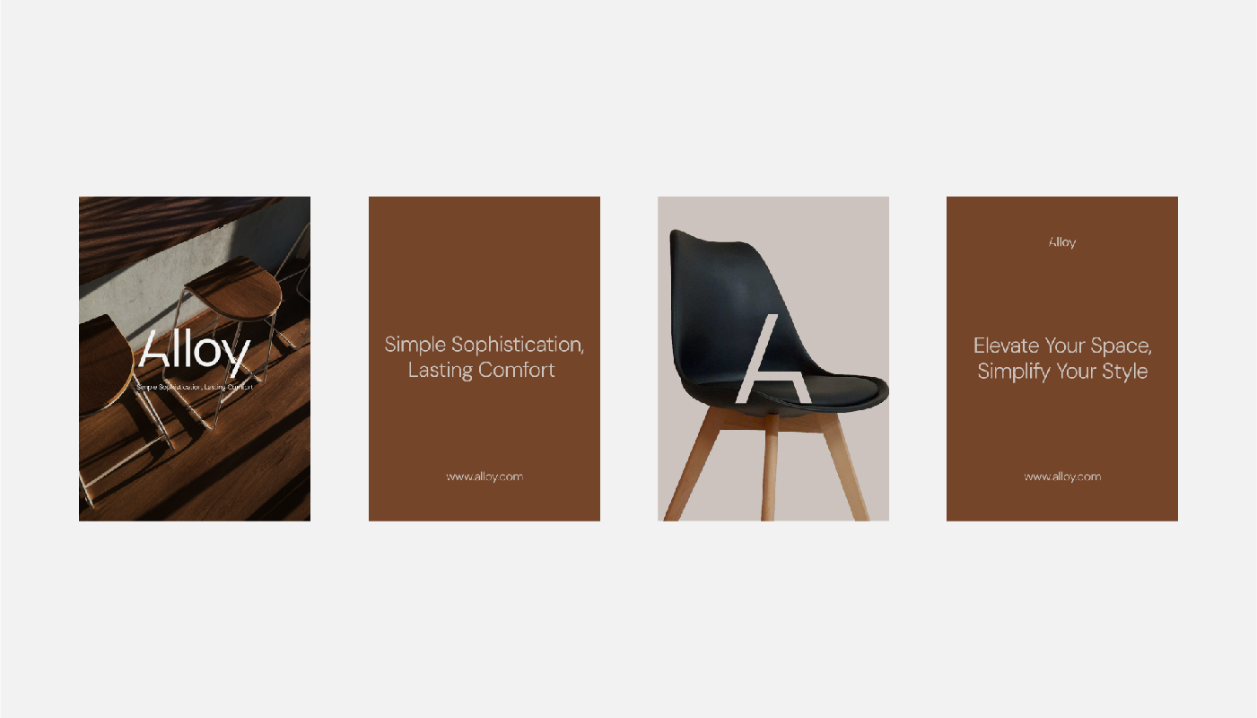
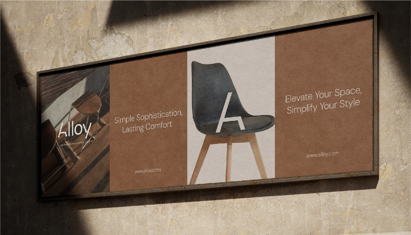
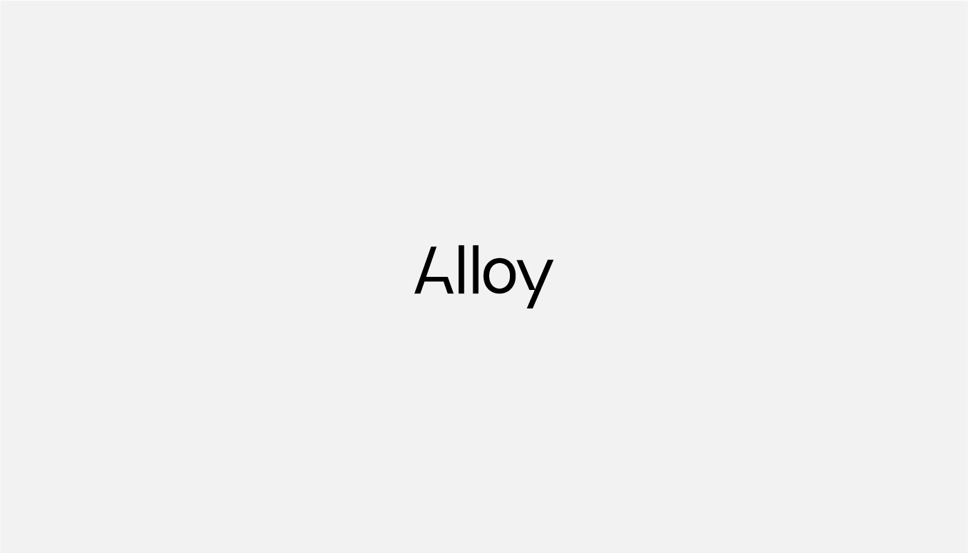
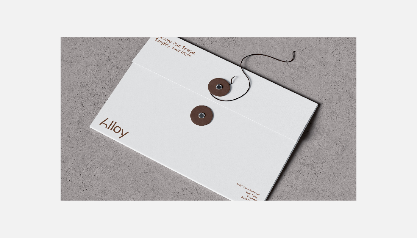
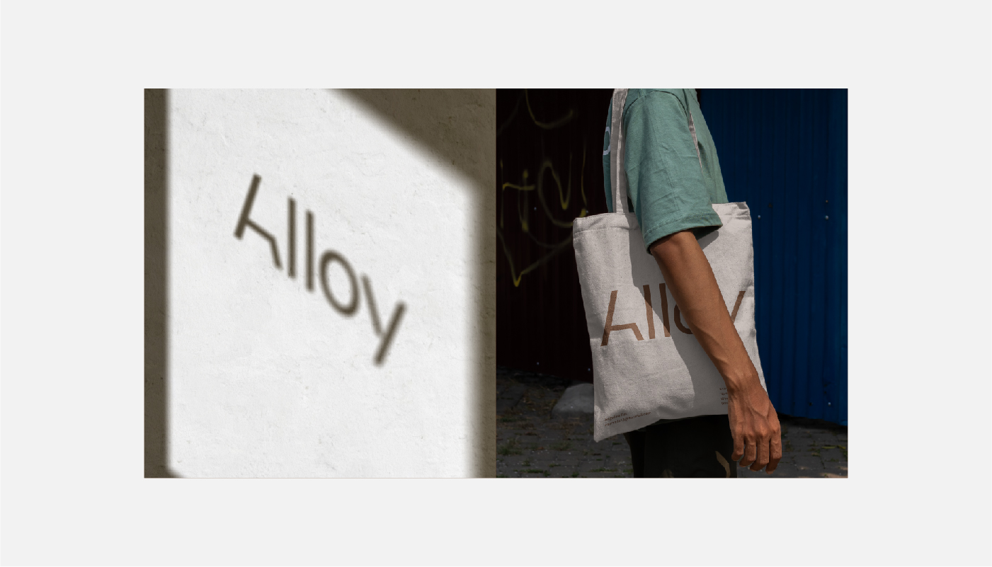
For the Alloy Furniture logo, I wanted to create something that feels strong, modern, and stylish, just like the brand itself. The name “Alloy” inspired me to think about mixing materials to create something unique, so I focused on making a clean and sleek typography-based design that represents both quality and durability.
Key Design Choices:
Typography:
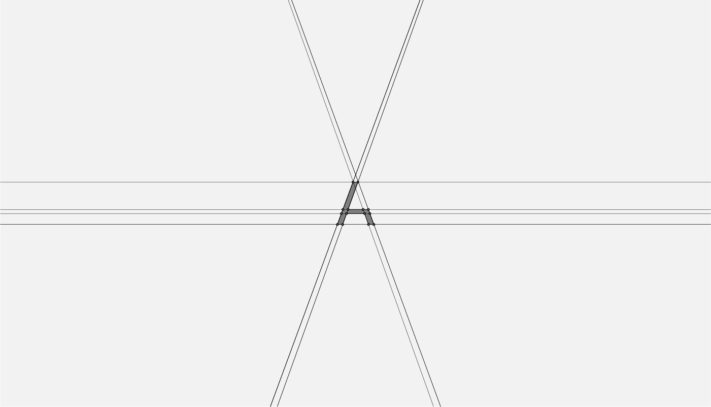
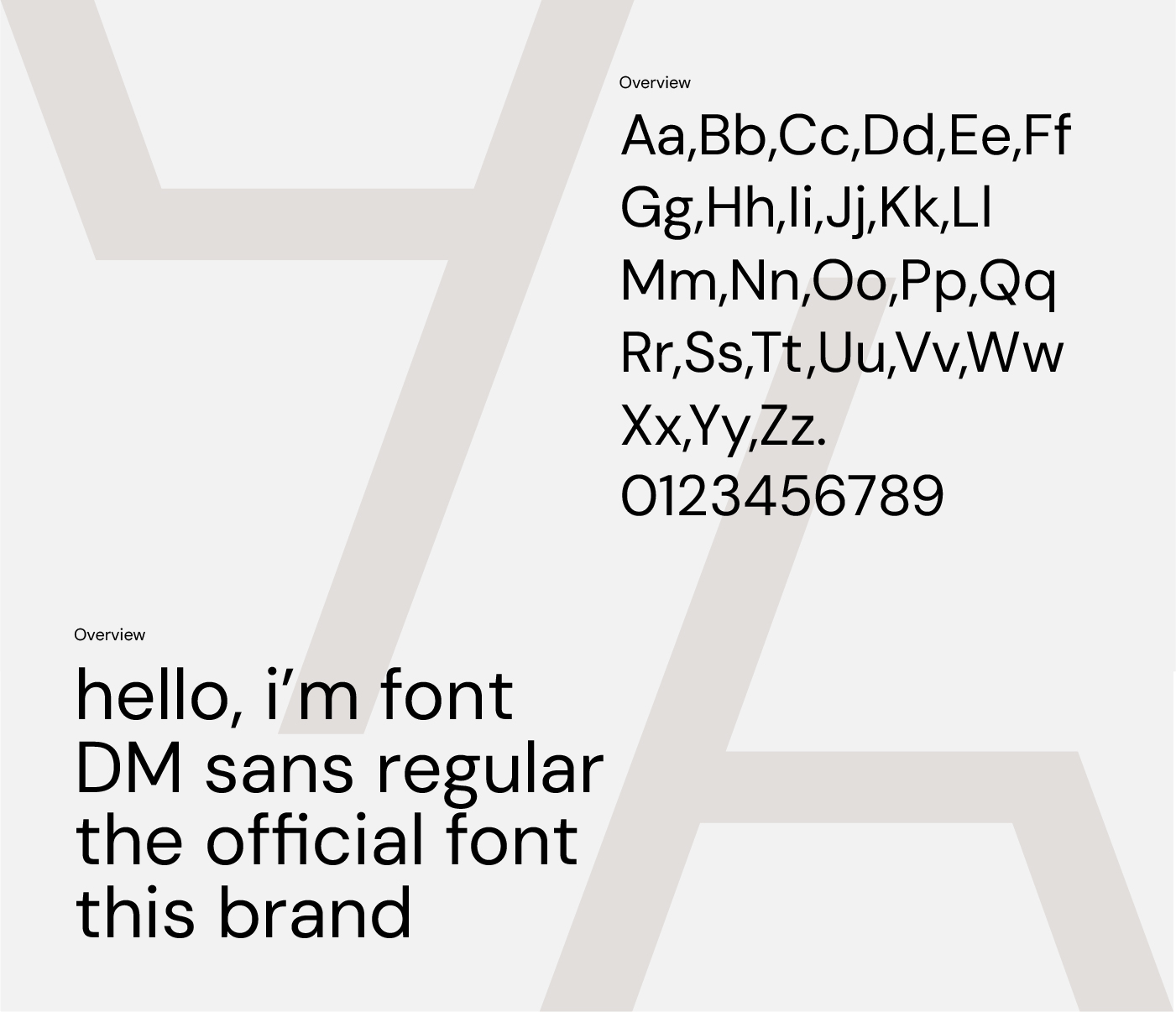
I chose a modern, sans-serif font that’s simple yet bold. The sharp lines and geometric shapes give it a clean, strong look, while still feeling fresh and easy to read. It reflects the brand’s focus on high-quality, precision-made furniture.
Customization:
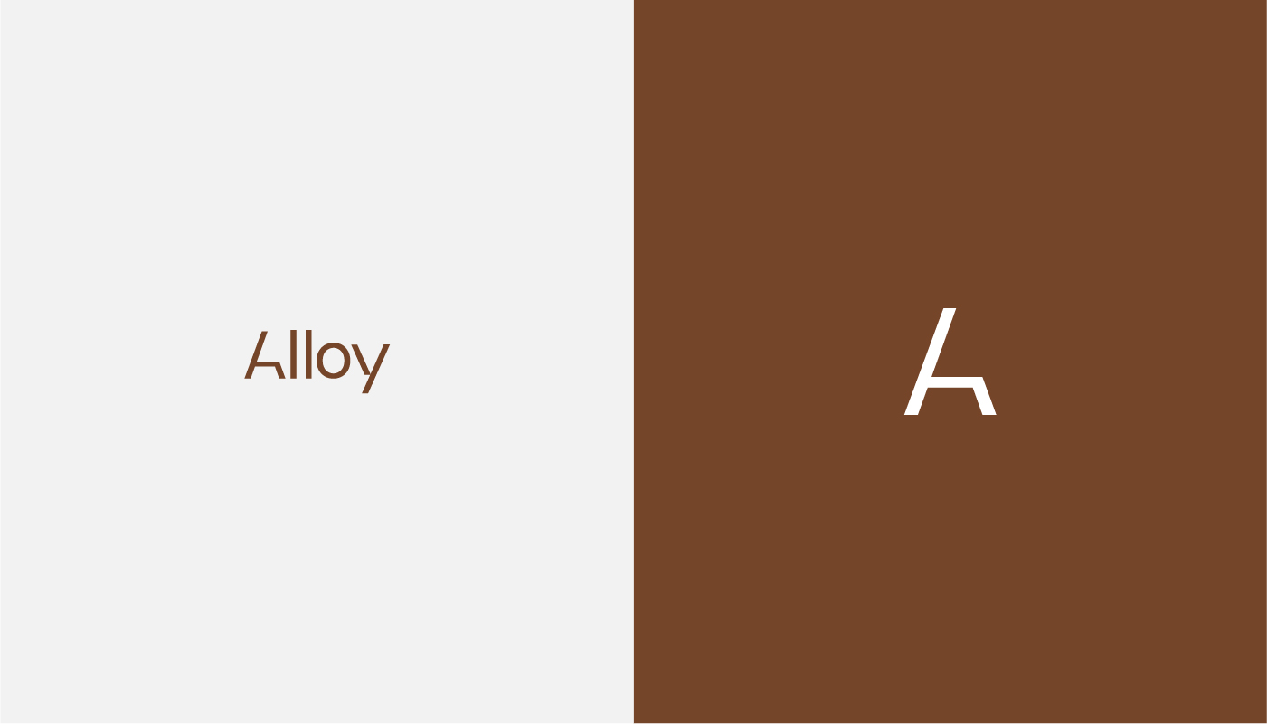
To make the logo stand out, I made subtle tweaks to a few of the letters. These small changes create a more unique feel and give the design a little extra personality, like how alloys are formed by combining different elements into something new.
Color Palette:
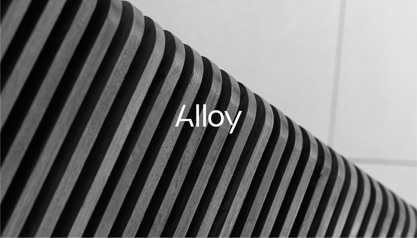
I went with a mix of neutral shades like charcoal gray and metallic silver, with touches of warm tones. The silver adds a hint of the alloy material, while the earthy colors help keep it grounded and inviting, perfect for a furniture brand.
Icon (if used):
If there’s an icon, I kept it simple and abstract, representing the strength and form of furniture. It works alongside the text to give a balanced, professional look.
Brand Vibe:
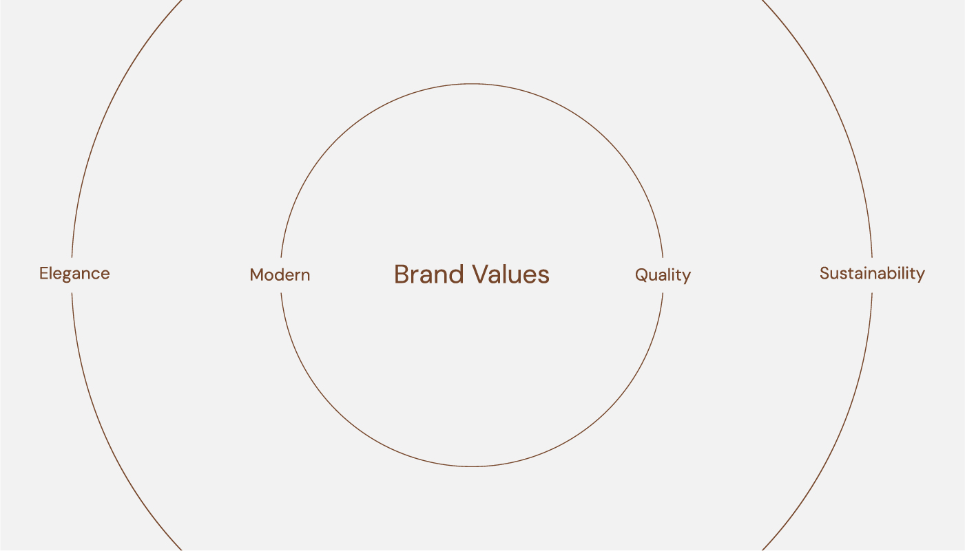
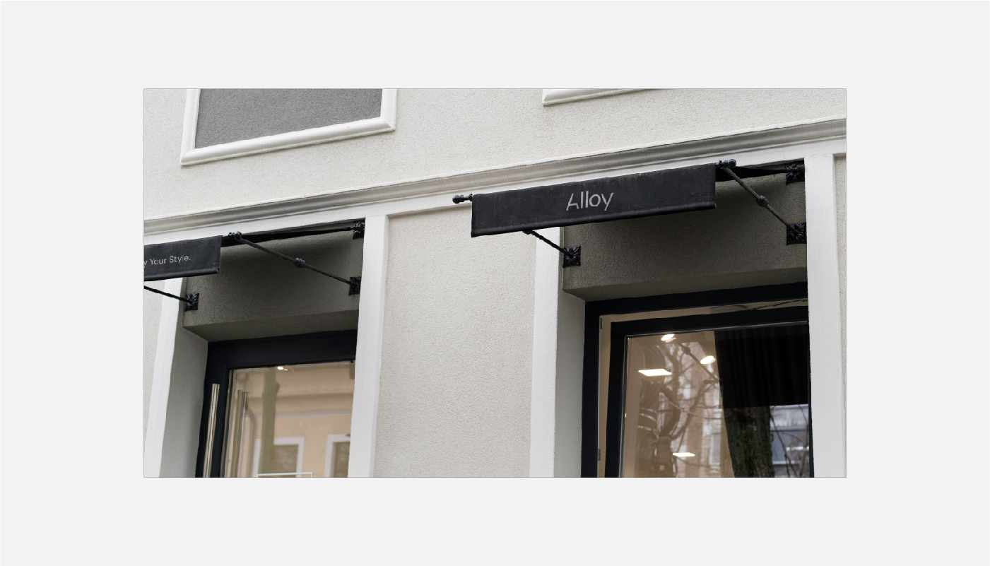
The logo reflects Alloy Furniture’s values—quality, craftsmanship, and innovation. It’s modern and minimal, yet strong, just like the furniture they create.
Flexibility:
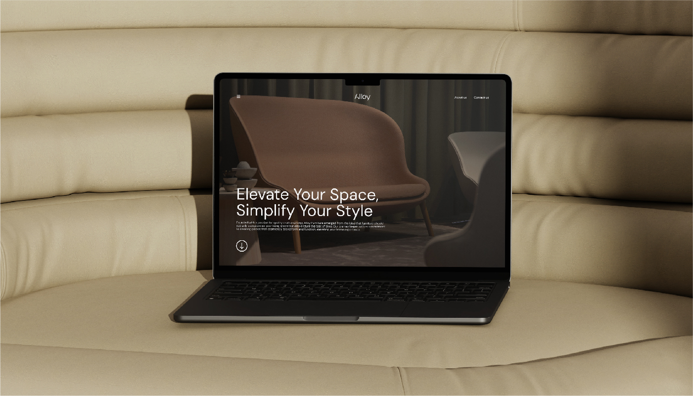
The design is versatile, looking great whether it’s on a website, social media, store signs, or packaging. It works in any setting, maintaining its impact wherever it’s used.